Cicada Press and the Annual Indigenous Print Workshop: Creating a New Movement

This article originally appeared in Vol. 51/No. 1 of Imprint Magazine, the Print Council of Australia Journal.  For more info on the Print Council of Australia, click here.

By Tahjee Moar

Sydney based curator and arts writer.

Each February, Cicada Press brings together Indigenous artists from diverse parts of the country to participate in the annual Indigenous print workshop. For two weeks, a small group of early and mid-career Indigenous artists share a studio at the University of New South Wales Art & Design to experiment and create through a new medium. Run by Tess Allas, Director of Indigenous Programs and Michael Kempson, Convenor of Printmaking Studies and Director of Cicada Press, the workshop is a space where stories are told by some of Australia’s most exciting Indigenous artists. The resulting works are bold and thought-provoking insights into contemporary voices in Australian art.

Historically, the study of Indigenous art practice has been through the lens of anthropology. As Indigenous Australian art historical discourses have slowly but increasingly become part of contemporary art discourses, so too has the diversity and plurality of their scope. This diversity was sought through Storylines, a large-scale research project undertaken by Allas, Professor Vivian Johnson and Laura Fisher in conjunction with Design & Art Australia Online, and a precursor to the annual Indigenous print workshop. Supported by a three year (2007-9) Australian Research Council Discovery grant supplemented by UNSW Art & Design, Storylines examined and documented Indigenous art making outside of ‘remote’ Aboriginal Australia. This covered regions in New South Wales, ACT, Victoria, Tasmania, the southern parts of Western Australia and South Australia as well as the eastern regions of Queensland, which lie south and east of the so-called Rowley Line; this referred to the invisible line existing across the map of Australia that was theorised by sociologist C. D. Rowley as dividing Aboriginal people into two distinct binary groups, ‘settled’ and ‘colonial’.
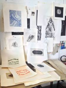
Wall of proofs

Wall of proofs

Of the Storylines research findings, Tess recounts, “we found that many artists from below the ‘Rowley Line’ were not seriously considered, written about, curated into shows or collected, nor did they seem to have the same access to art workshops, studios, equipment or the actual ‘artworld’ as those who are based in art centres above the Line.” With the aim of enabling Indigenous artists access to studio spaces within the University, Allas and Kempson, who Tess says “has been one of the very few people who have helped to address this imbalance by opening his studio to as many artists as possible,” formally established an annual residency program through Cicada Press in 2012. The result was a program that removed Indigenous printmaking from the confines of north Australia and allowed a diversity of Indigenous artists to test new ideas, participate in new conversations and produce new work in printmaking. To date, Cicada Press, through the programs organised by Allas and Kempson, has hosted residencies for such artists as Tony Albert, Fiona Foley, Vernon Ah Kee, Brenda Croft, Gordon Hookey, Reko Rennie, Dale Harding, Laurel Nannup, Brett Nannup, Ryan Presley, Jason Wing and Frances Belle Parker.

Brenda Croft discussing her work with master printer Michael Kempson. Ryan Presley looking on in the background

Brenda Croft discussing her work with master printer Michael Kempson. Ryan Presley looking on in the background

Brenda Croft happy with the finished work

Brenda Croft happy with a finished work


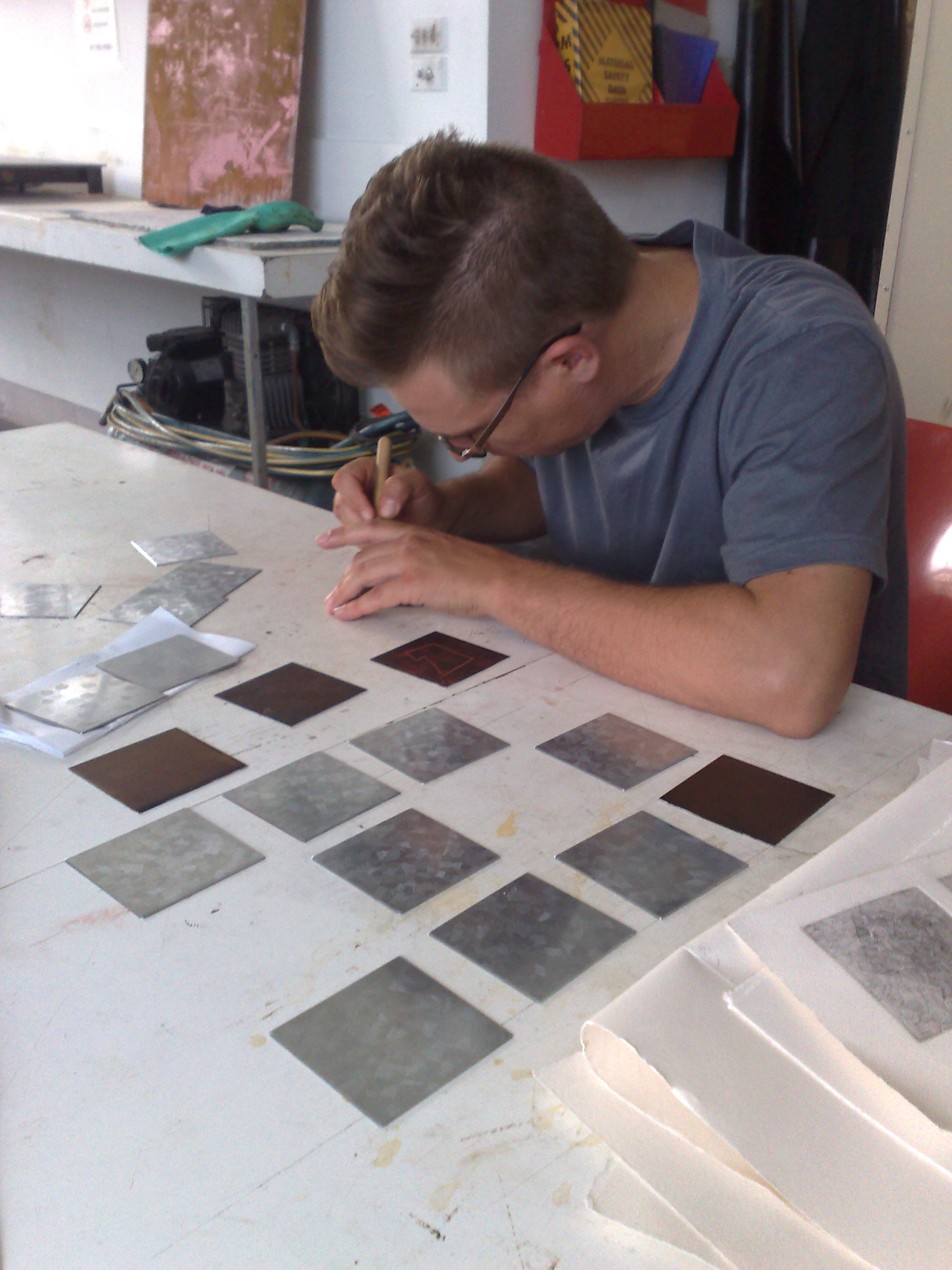
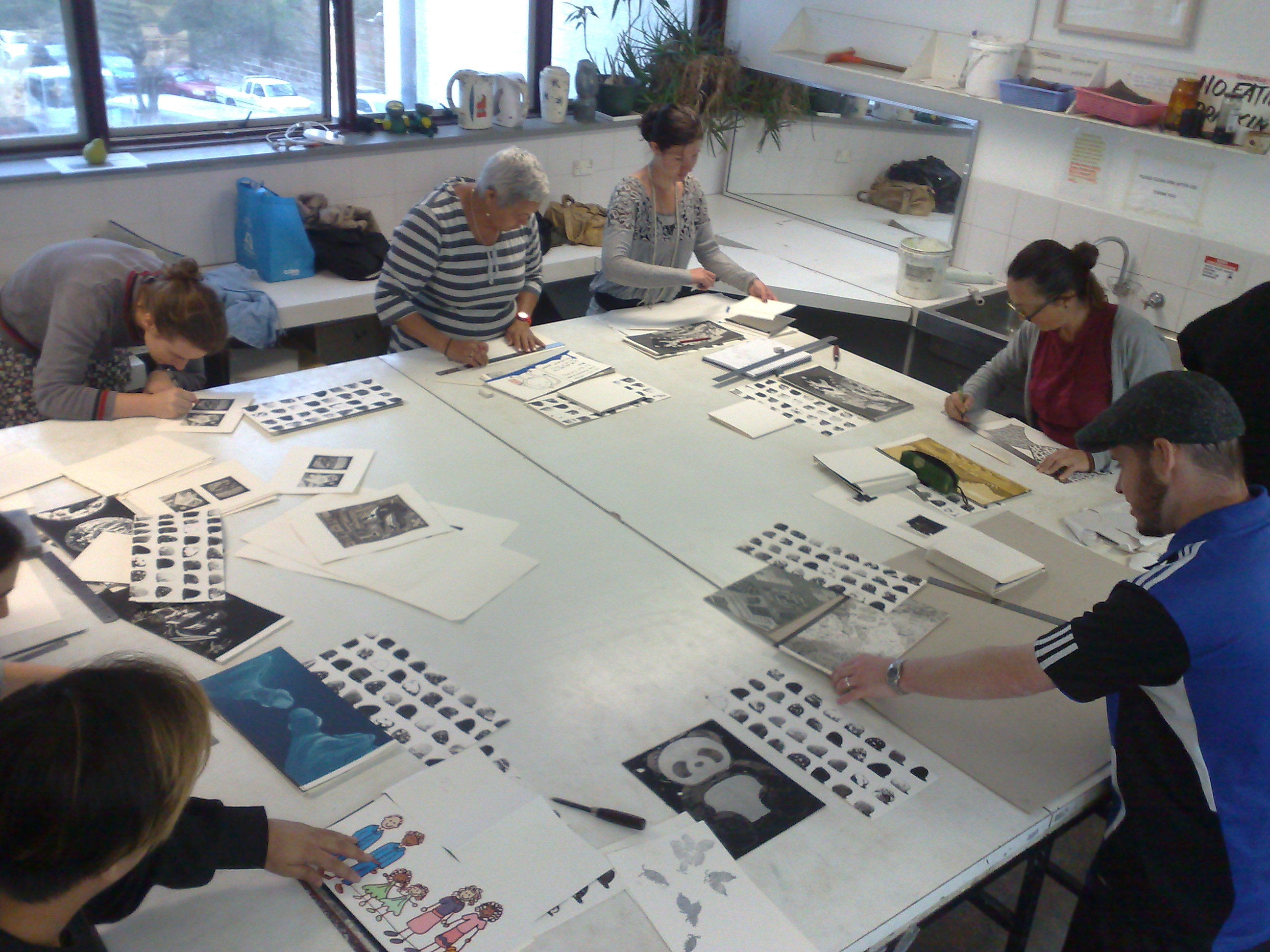
An educationally based custom printmaking workshop founded in 2004, Cicada Press functions as a space where professional artists are invited to produce a body of work with the support of Kempson and UNSW students. Often, the artists will be new to the medium as well as the experience of participating in a university residency. “As a rule we like to invite artists who generally have no experience with printmaking,” Kempson says. “We think it is important that residencies are offered to artists who might never get the opportunity to encounter art making in a university context.” Tess adds that what the workshop also seeks to nurture is “a space where [artists] can be artistically challenged and learn new skills.” The result is a space that combines traditional pedagogy and an academic studio setting with the teachings of those with personal and lived experiences

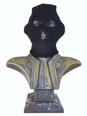
A recent participant in the workshop is Sydney-based artist Tony Albert, who is of Girramay, Yidinji and Kuku-Yalanji descent. Following the year in which he was a recipient of the National Aboriginal & Torres Strait Islander Art Award and the Basil Sellers Art Prize, Albert was invited to participate in the 2015 workshop. For Albert, it was an opportunity to explore a new medium and develop his artistic practice. “The idea of not being stagnant and continuing to challenge your own technical practice is important,” he says, “how I think and feel is to push my practice.” Albert, whose body of work has included working in mixed media installations and photography, often uses his work to interrogate the legacies of colonial histories, focusing on representations of Aboriginality. A distinct characteristic of his practice involves recycling what he calls “Aboriginalia”, kitsch objects that naively depict Aboriginal people. Translating his aesthetic and conceptual concerns to a two-dimensional medium, Albert produced the Ashtray series, a series of etchings based on the vintage ashtrays depicting Aboriginal people, which today can be seen as powerfully symbolic objects. The resulting works are challenging reminders of the ways in which Aboriginal people have been historically portrayed in Australian society, evoking inquiry around prevailing racist attitudes in contemporary Australia.

11754801_715261555269268_7461553653705624265_o

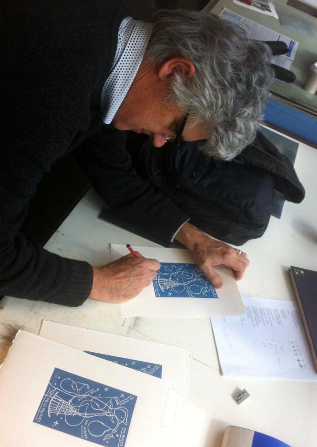
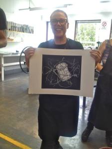
Tony Albert signing his series

One of Tony Albert's ashtrays

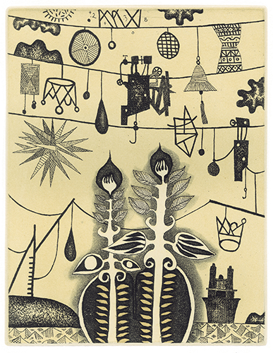
One of Tony Albert’s ashtrays

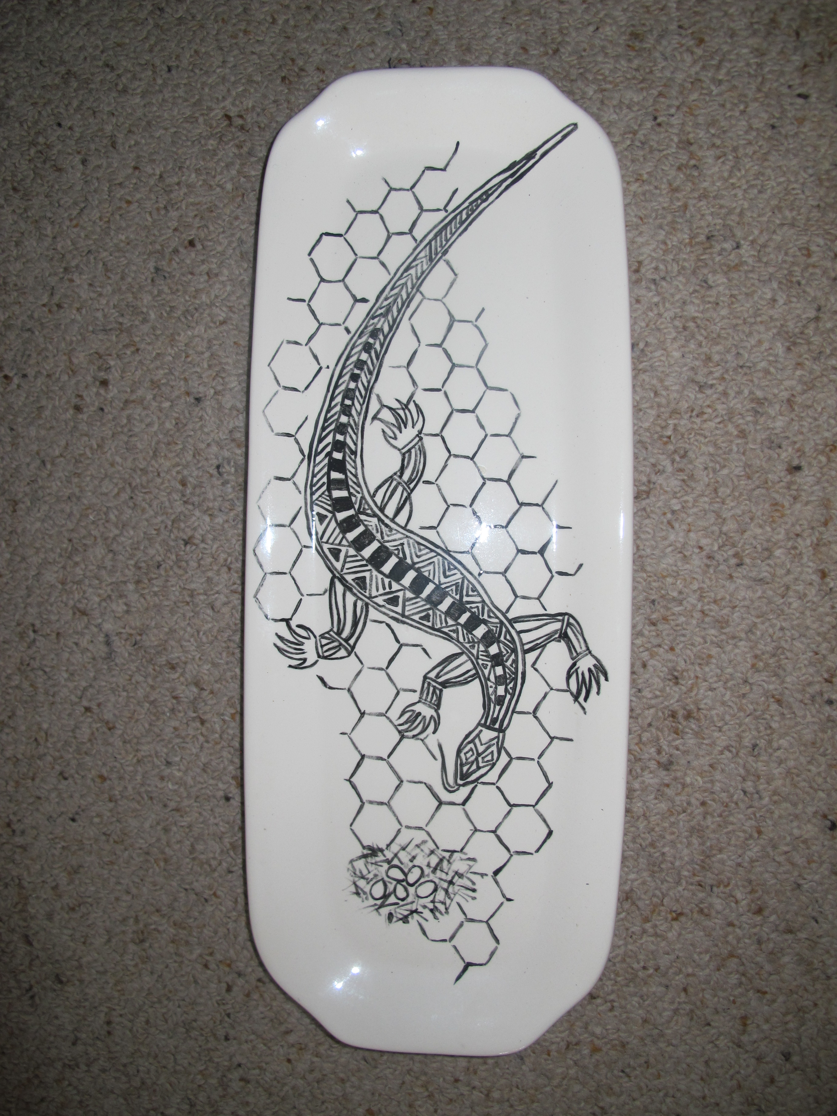
The 2015 Indigenous print workshop saw the Adelaide-based early-career artist Raymond Zada, who is of Barkindji descent, create a series of prints using digitally derived motifs. One of these was the work, Rowley’s Line, which borrowed from the text in C. D. Rowley’s, ‘The Destruction of Aboriginal Society’ (1970) – the story that influenced the workshop. A work consisting of text and dotted lines over a strategically made black and white background, Zada’s work explores Rowley’s seemingly outdated logic and its applicability to existing paradigms surrounding Indigenous cultural identity. Zada’s practice has involved using mediums such as new media, photography, video and digital design to express the stories of displaced Aboriginal people. In 2012, he won the work-on-paper prize at the Telstra National Aboriginal and Torres Strait Islander Art Award. For the artist, participating in a collaborative studio environment was a new experience, “I had never produced art in the presence of anyone else,” recalls Zada, “[m]y practice always involved me working alone and nobody would see works in progress; so it was daunting having people see me work through ideas, which often just involves me staring at a computer screen.” He concluded, however, that the workshop was important, as it provided a “safe and supportive space for artists to step out of their comfort zone and try new things.”

Proofs of Raymond Zada's etchings

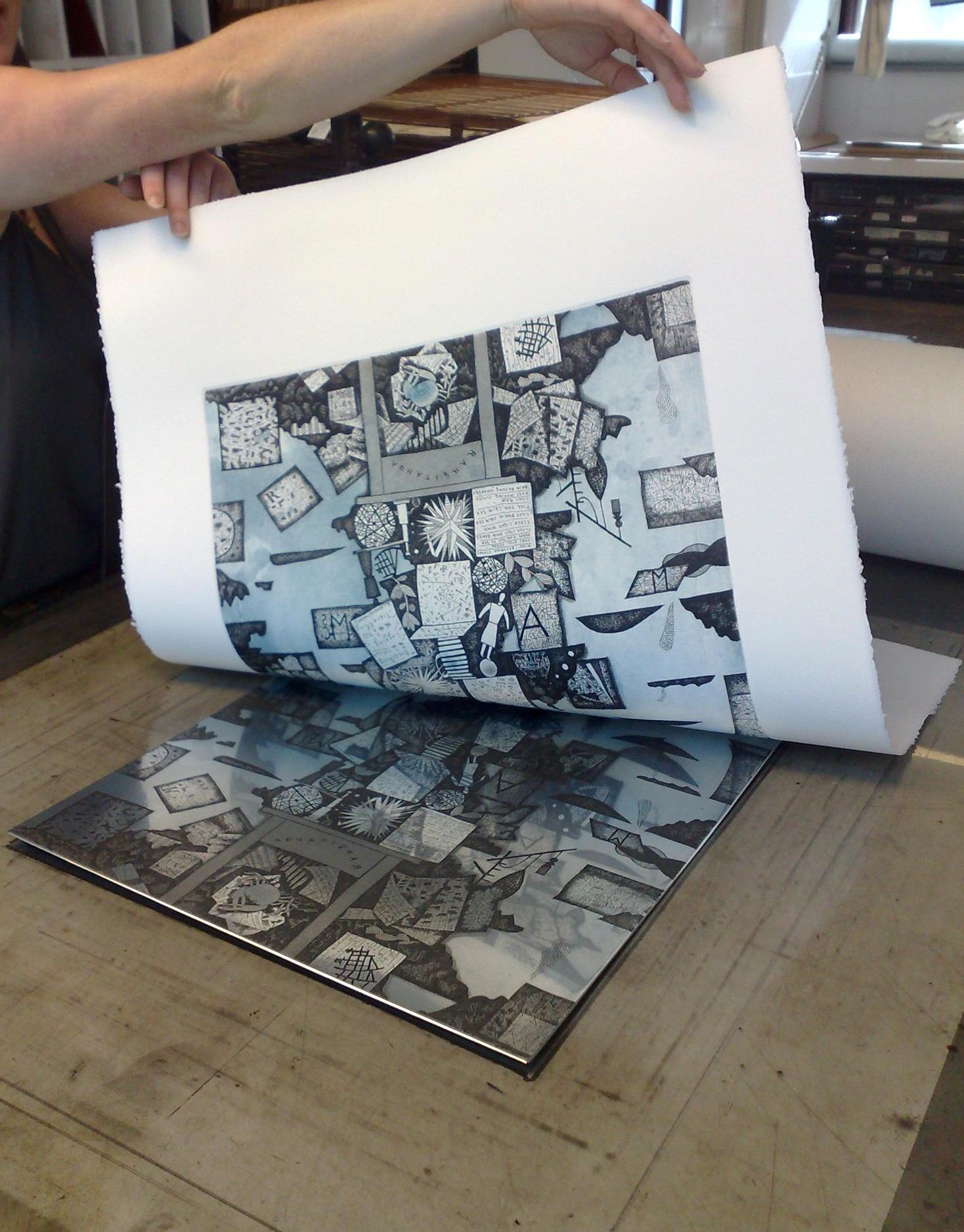
Proofs of Raymond Zada’s etchings

Another artist who has participated in the workshop is Dale Harding, a Brisbane-based artist of Bidjara, Ghungalu and Garingbal descent. Harding’s practice often involves investigating the social and political realities experienced by members of his family who lived under government control in Queensland. Re-telling the stories of his family, Harding’s prints Bright Eyed Little Dormatory Girls, Sack 1, 2 & 3 are a reminder of Australia’s untold histories from a perspective of lived experience. For the artist, participating in the workshop to realise the works was experience built on exchange and understanding. He says, “collaborating with Michael and Tess to translate some of my works into etchings was entirely like a great conversation between friends in a mutual second language.” Since participating in the workshop, Harding’s prints, like those of Albert’s and Zada’s, have featured in Cicada Press’ international and national touring exhibitions.

Dale Harding working on some etchings

Dale Harding working on some etchings

Dale Harding's proofs on the wall

Dale Harding’s proofs on the wall

In an artistic climate where printmaking continues to be an underrepresented medium in contexts for contemporary art, Cicada Press’ Aboriginal print workshop offers a positive story; one in which contemporary artists are engaging and experimenting with the formal and conceptual potential of printmaking practices. In the context of tertiary institutions, in which a significant portion of research and activity takes place for professional and practicing artists, Cicada Press’ residency program gives way to a thriving university-based printmaking community. This could be seen as offering something of a contrast to the decreasing interest and demand for printmaking programs elsewhere that have seen entire printmaking programs removed from the curriculums of several significant universities throughout Australia. Cicada Press succeeds in rupturing the insularity of an academic environment, bringing in new voices and perspectives and presenting them to international and national audiences through its touring exhibition. For its Indigenous artists, this is an important aspect of what it does, as Albert says, “the workshops are important . . . we now have these previously untold stories traveling around the world.”

Damien Shen, Ryan Presley, Tahjee Moar and Michael Kempson examining a proof of Damien's etching

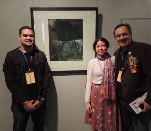
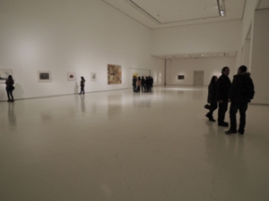
Damien Shen, Ryan Presley and Tahjee Moar examining a proof of Damien’s etching

Since their establishment, the workshop has produced something of a development in Indigenous art. It has seen a variety of Indigenous artists inject new voices and perspectives into an often-unexplored medium, becoming part of the ongoing history of printmaking in Australia. Most importantly, it offers an active space for the development of diverse and new voices in Indigenous art practice, as Allas says, “it is providing an opportunity for people to see there are stories to tell below the Rowley Line.”


Lyrical in Nature – The collaborative nuances of Gregory O’Brien

By Rebecca O’Shea, M.Art Admin UNSW Art & Design, BCA UOW

Cicada Press at UNSW Art & Design in Sydney, is involved with many projects that employ art as a mechanism for broadening social consciousness, all the while interconnecting with a passion for the printed form and the exchanges it enables. Two printing projects involving New Zealand artist Gregory O’Brien offer examples of such an exchange, and how collaborative partnerships can have a participatory role in changing culturally ingrained attitudes toward the environment.

Gregory O’Brien, a recipient of the New Zealand Prime Minister’s Award for Literary Achievement in 2012, identifies ‘foremost as a writer and poet, though, also as an artist’[1] often uniting the visual art and literary worlds. He explains, ‘that rather than seeing the disciplines in contradiction, working in both areas is a way to become creatively ambidextrous within the forms’. Echoing the tenants of French Symbolism, O’Brien enjoys the notion that there is poetic resonance in all the art forms through the fundamental formulas that they share, such as form, narrative and texture.

Gregory O’Brien Writer's Table (K. M. at Villefranche) 2010 etching

Gregory O’Brien Writer’s Table (K. M. at Villefranche) 2010 etching

The opportunity to collaborate with Cicada Press instigated an exciting way of working for O’Brien, and in so doing affirmed his love of paper as a medium. For O’Brien, the printed form offers a perfect meeting place between the paradigm of published books and original artworks, as the technology of intaglio incorporates aspects of both. While working on his new etching ‘Whakaari/White Island obscured by seabirds’ to be developed at Cicada Press in 2014, O’Brien regretted that he had not pursued printmaking, with its inherent tradition and abundant possibilities, much earlier in his career.

Gregory O'Brien Basement Kitchen  2008, etching, in the boxed set Crossing the Tasman.

Gregory O’Brien Basement Kitchen 2008, etching, in the boxed set Crossing the Tasman.

O’Brien signing Basement Kitchen

O’Brien signing Basement Kitchen


Since creating his first etching with Cicada Press in 2008 for the boxed set, Crossing the Tasman, O’Brien has produced over 30 prints. Since 2010, many of these were developed collaboratively with fellow New Zealand poet and artist, John Pule. Sailing to Raoul (2011) and What I did and did not have (2012) are specific examples, demonstrating the complementary fusion of the artists’ approach to collaborative practice through print.


Gregory O’Brien and John Pule Sailing to Raoul 2011 etching, aquatint with colour roll

Gregory O’Brien and John Pule Sailing to Raoul 2011
etching, aquatint with colour roll


Gregory O'Brien and John Pule What I did and did not have 2012           etching, aquatint with colour roll

Gregory O’Brien and John Pule What I did and did not have 2012
etching, aquatint with colour roll


Collaboration is at the core of O’Brien’s approach. He ‘sees art as a conversation that allows human experience and intelligence to be brought together,’ be it through curating, writing, creating or being a visiting resident in a communal print workshop. The collaborative process is one that allows for inspiring experiences to be shared by like minds.

The Kermadec project, a creative expedition made by nine artists to the Kermedecs aboard the HMNZS Otago in 2011, is an ongoing interdisciplinary collaboration in which O’Brien acted as an advisor and coordinator. The aim of the project is to advocate for the protection of a 620,000 square kilometre region centred on Raoul Island along the Kermadec trench, a natural formation resulting from the subduction of the continental Pacific and Indo-Australian tectonic plates. It is an ecologically diverse, relatively undisturbed expanse of water that spans the northern tip of New Zealand through to the Tongan Islands. As ‘Science has difficulty capturing the public’s imagination [just] as art can’ the PEW Environment Group invited O’Brien to gather an artistic cohort to visit this unique environment. The diverse body of work produced, culminated in the travelling Kermadec exhibition.

Jason O'Hara Group Shot

Jason O’Hara Seariders on Raoul 2011


The nine artists selected, including O’Brien, were New Zealand artists, John Reynolds, John Pule, Robin White, Phil Dadson, Jason O’Hara, Elizabeth Thomson, Bruce Foster as well as Australian artist Fiona Hall. O’Brien, described the venture as ‘an inspiring and galvanising experience’ with ‘a great crew’. Drawing on the sights and experience, each artist produced a print for the suite Voyage to the Kermadecs, that was developed at Cicada Press in 2011 and included O’Brien’s piece, A Crown for the Kermadec King 1. The zinc plates, on which the artists inscribed their reflections, were worked on during and after the trip – the experiential memory of the voyage now etched on their surface. O’Brien commented that Michael Kempson and Cicada Press ‘were integral from the beginning to the print-project which, as it turned out, proved to be a lively and interesting component in the ‘Kermadec’ art production’.

Gregory O'Brien A Crown for the Kermadec King I 2011 intaglio etching with colour roll

Gregory O’Brien A Crown for the Kermadec King I 2011 intaglio etching with colour roll


O’Brien’s Kermadec investigations included an accumulation of ‘notes for drawings and poems’. These were ‘inspired variously by the omnipresent sea, the charts and electronic gadgetry on the ship’s bridge’, as well as the daily cycles of nature and the magnificent rising and setting of the sun[2]. Poems that articulate O’Brien’s experience of the journey can be found in Beauties of the Octagonal Pool (2012) and on the Kermadec website.

Jason O'Hara

Jason O’Hara Raoul Island at Dawn 2011


Reflecting on poems and drawings created during the trip, O’Brien recalls a resonant chord that was felt by all who made the voyage to experience Raoul Island; ‘a strident, rejuvenating, energising sound, a note struck in defence of that which is worth preserving on this planet.’[3] Though not a prerequisite for attendance on the Kermadec voyage, advocacy for its protection seems to be a significant outcome for each of the artists, their tangible expressions offering insights into this vulnerable pristine environment.


Gregory O'Brien Raoul Island survey with shipping containers Astroloble Reef 2012-13 etching, aquatint and spit-bite from 2 plates

Gregory O’Brien Raoul Island survey with shipping containers Astroloble Reef 2012-13 etching, aquatint and spit-bite from 2 plates


Gregory O’Brien’s immersive print, Raoul Island Whale Survey with shipping containers, Astrolabe Reef, is a two-plate etching and aquatint in brown black and grey blue, produced by Cicada Press in 2013. Inspired, in part, by the Kermadec Project, it references both his time spent on Raoul Island, situated in the northern part of the Kermadec Ridge, as well as Astrolabe Reef, located in the Bay of Plenty just outside of the Kermadec Ridge. ‘Astrolabe Reef was the site of an environmental disaster in October 2011, when a container vessel ran aground, spilling oil and debris into the surrounding ocean.’ While the etching contemplates thebenevolent and positive agency of humanity that is embodied by the whale watchers and the conservation project on Raoul Island, it also engages with how humanity can get things very wrong.’

Two plate colour proof alongside colour proof of the support plate

Two plate colour proof alongside colour proof of the support plate

Raoul Island Whale Survey with shipping containers, Astrolabe Reef was completed via international correspondence between O’Brien and Kempson. As printmaking can already be an exacting process, working with the alignment of multiple plates, as well as communicating across continents made the process all the more exacting. The etching plate was first sent to New Zealand for the image to be drawn, followed by O’Brien’s visit to Cicada Press in Sydney to continue discussion with Kempson and make aesthetic decisions on colour and technique for the print’s resolution. To suggest the presence of an ocean, the spit-biting process was used on the supportive plate, creating tonal variation in the grey-blue wash. The hydrous blotches evoke the character of islands and the movement of currents, creating an aerial perspective that complements the key plate, where natural elements are juxtaposed with human gadgetry and poetic text, components that are characteristic of O’Brien’s oeuvre.

Editioning day at Cicada Press-lifting the print from the key plate, 2013

Editioning day at Cicada Press-lifting the print from the key plate, 2013


Produced as part of a print project designed to raise funds for the development of a National Whale Centre in Marlborough, New Zealand, the theme of O’Brien’s print unites with its purpose, the outcome being sold through Wellington’s Bowen Galleries. Following the screenprint by Auckland based artist Dick Frizzell, O’Brien’s etching is the second of this series, which continues with contributions by John Walsh, John Pule, Michael Tuffery and Fiona Hall. ‘The National Whale Centre is the vision of former Director of the National Gallery of New Zealand, Luit Bieringa’, who, inspired by the Kermadec project ‘decided to produce a print suite on the theme of whales to help raise money for the venture’. With this contribution, the museum has developed from solely a virtual presence to an actual one in late 2014, becoming the first museum in New Zealand to offer a specifically oceanic focus. The Picton foreshore is an apt location, for it is a community with 172 years of history as the hub of New Zealand’s former whaling industry. There is now a shift to simultaneously acknowledge this history while initiating environmental research, focusing on the more sustainable industries of cultural and eco-tourism.

 (L-R) Gregory O'Brien Tuhua (Mayor Island) obscured by seabirds 2014 etching and aquatint Gregory O'Brien Raoul Island obscured by seabirds 2014 etching and aquatint Gregory O'Brien WhakaariWhite Island obscured by seabirds 2014 etching and aquatint

(L-R) Gregory O’Brien Tuhua (Mayor Island) obscured by seabirds 2014 etching and aquatint
Gregory O’Brien Raoul Island obscured by seabirds 2014 etching and aquatint
Gregory O’Brien WhakaariWhite Island obscured by seabirds 2014 etching and aquatint


With another stint in the Cicada Press studios in 2014, O’Brien continued his ecological reflections and collaborative inclinations with a beautiful series of birds in flight, including an etching with regular collaborator, John Pule. Through a veil of silhouetted birds, the viewer glimpses the volcanic Raoul, White and Mayor Islands of the Kermadec trench. The nuance in tone and texture is achieved through a combination of etched line work and aquatint. In contrast, O’Brien’s relief etching Low land, high water / Rekohu, Chatham Island and collaborative print with John Reynolds, Notes on the Raising of the Bones of Pablo Neruda at Isla Negra, demonstrate the graceful unison of contoured line-work and text, making use of the printed form as drawing and visual mapping to describe place and experience.

chopped and signed, 2014

Chopped and signed, 2014

Gregory O'Brien Low land, high water Rekohu, Chatham Island relief 2014 etching lined up on the drying rack

Gregory O’Brien Low land, high water Rekohu, Chatham Island relief 2014 etching lined up on the drying rack


The lyrical imagination of Gregory O’Brien brings a distinctly individual motif to printmaking with the combined use of image and text. Describing ‘art as a song rather than a lecture’ he explains that while being ‘advertently political doesn’t interest him, there are underlying messages, both in his art and poems, that consider such things’.

            Gregory O'Brien and John Reynolds Notes              on the Raising of the Bones of Pablo Neruda              at Isla Negra 2014 etching

Gregory O’Brien and John Reynolds Notes
on the Raising of the Bones of Pablo Neruda
at Isla Negra 2014 etching


‘It is important to still consider notions such as beauty and truth, proportion and balance, in the modern world – especially in consideration of the environment, working towards the future, thinking more seriously about preserving what we have and celebrating it in a positive way…yes they are romantic notions but (in many cases) they are the values of individuals and the community that need to be nurtured.’

The conception of interdisciplinary partnerships, such as the National Whale Centre’s print series and the Kermadec project, are constructive examples of nurturing and furthering values of community, connection and preservation through art. Through collaborative initiatives, like those conducted between Gregory O’Brien and Michael Kempson at Cicada Press, artists and facilitating organisations contribute to a wider discourse that promotes ecological consciousness.

[1] All quotes unless otherwise stated are from correspondence between Gregory O’Brien and Rebecca O’Shea

[2] O’Brien, G Kermadec: Nine Artists in the South Pacific, ‘Kermadec, Gregory O’Brien, http://www.thekermadecs.org/kermadec-nine-artists-in-the-south-pacific

[3] O’Brien, G ‘A Crown and a Bell for the Kermadecs

http://www.studioj.co.nz/kermadec_exhibition/obrien_texts/

Michael Kempson

By Anthony Springford

Surrounded by neat ranks of cast iron printing presses and the smell of resin, bitumen, grease and ink, Michael Kempson’s office reminds me of a Merzbau. I can’t see the walls for books and towers of steel drawers, and it takes Kempson a minute to clear me a seat wedged under an overhang of cardboard. I think there’s a desk in here somewhere, but the University of New South Wales Australia’s convenor of printmaking studies doesn’t strike me as man who sits still for very long. His father was an Anglican minister, and he is quick to suggest that he is something of an evangelist for the social and educational value of printmaking.

Michael Kempson working with Reg Mombassa

Michael Kempson working with Reg Mombassa

UNSW Art & Design teaches etching, relief and lithography; centuries-old techniques in which each print is handcrafted and unique. Editioned prints have been part of the vocabulary of Western art since the seventeenth and eighteenth centuries. Goya, Toulouse-Lautrec, Matisse and Picasso used etching and lithography to produce works that could be seen and owned by a middleclass public. But since the second half of the 20th century, digital and photographic technologies offer increasingly easy ways to distribute images. Printmaking departments all over the world now have to fight for their place between one-off art objects and a global culture of digital media, photography and video.

Consultation with Pakistani artist Saeed Akhtar

Consultation with Pakistani artist Saeed Akhtar

Kempson draws a parallel between printmaking and jazz music; both are highly technical, experimental, open and collaborative, with a rich tradition of innovation. To the uninitiated at least, printmaking and jazz can also seem arcane, sustained by a core of devotees and a bit out of date. For Kempson though, it is because printmaking is difficult that it tends to be collaborative and workshop based, fostering connections between artists. Unlike the lonely studio, the print room is a space for political, social and artistic exchange.

Examining a proof

Examining a proof

In 2004 Kempson established Cicada Press with a mission to teach and promote printmaking through collaboration. Well-known artists from around the world are invited to UNSW to collaborate with students on an edition of prints. Cicada offers the artists an opportunity to expand their own practices by trying out new techniques, while students learn by being directly involved in a professional artist’s work.

In the ego-driven world of contemporary art it is rare to see artists of different generations sharing the creative process, but so far Cicada has worked with over 170 artists to produce over 1300 editions of prints. For Kempson; “openness with empathy towards the other is crucial in the collaborative projects at Cicada Press.” Some artists, such as Vernon Ah Kee or Fiona Hall, bring very conceptually rooted approaches to printmaking, while others, such as Elisabeth Cummings or Guy Warren, explore more direct and gestural uses of the medium.

(L to  R) Michael Kempson, Elisabeth Cummings and Sally Marks

(L to R) Michael Kempson, Elisabeth Cummings and Sally Marks


Representing in China

Representing in China

This philosophy of generosity and collaboration extends beyond the workshop. In 2006 Cicada Press worked with artists from the central desert community of Papunya, including Michael Nelson Jagamara, on an edition of prints. Artists came to Sydney and UNSW students visited Papunya to realise a unique exhibition of linocuts and etchings that helped to raise money and awareness for the new Papunya Tjupi art centre. More recently Cicada has participated in exchanges and residencies with institutions in Pakistan, Thailand, Taiwan, Canada, New Zealand, Korea, China and the USA, enabling students and staff to build enduring professional relationships across Asia. In 2010 Cicada took an exhibition of indigenous prints to Karachi, and in 2012 it sponsored a travelling exhibition of Chinese and Australian prints that included artists from Papunya.

Michael Kempson is taking his social and artistic ministry, and his students, around the globe. He is changing the way the visual arts are taught and practiced, and perhaps even fostering a more collaborative and generous world in the process.


Anthony Springford is a Sydney based artist and writer.


Semblance of Order – Imprint Magazine

Picture 1

Last year’s Semblance of Order residency and exhibition has been written about in the current Imprint Magazine (Print Council of Australia Journal).  For those of you who don’t remember, Semblance of Order was :

presented in association with Parramatta Artists Studios. With cross cultural collaboration as its core, Semblance of Order is a travelling exhibition promoting Australian and Pakistani art and artists across borders and platforms.

Exploring the limits of printmaking, the exhibition presents etchings and silkscreen prints by five artists from Pakistan and Australia. Featuring Roohi Shafiq Ahmed, Michael Kempson, Ben Rak, Abdullah M.I. Syed and Adeel-uz-Zafar. Curated by Abdullah M.I. Syed.

Semblance of Order is the result of an international artists’ residency program delivered in partnership between Parramatta Artists Studios and Cicada Press (College of Fine Arts, UNSW), Sydney, Australia.

Imprint Magazine has kindly given us permission to reproduce the relevant pages and give you all the chance to read the article written by Angela Butler.

Click here to read the article 3691 Imprint Vol49 No1 _p12+13

Reproduced with permission from the Print Council of Australia, publisher of IMPRINT magazine: http://www.printcouncil.org.au

Jason Wing – Copy of its own right

By Rebecca O’Shea
Artist, Arts Writer, Masters of Arts Administration COFA, Bachelor or Creative Arts UOW

Jason Wing is a prolific Australian artist, working in various mediums to examine social and cultural identity. Being of Aboriginal and Chinese heritage he owns this experienced duality between two cultures in the adjudication of his body of work, which was activated in street art and has continued in photography, painting, installation, sculpture, and now, printmaking. [1] In correspondence with Jason Wing I asked him about his experience at Cicada Press in 2012 and the transference of an idea through different mediums.

In 2012 Jason Wing was the winner of the Parliament of NSW Aboriginal Art Prize with his work Australia was Stolen by Armed Robbery, a sculpture which entailed the placement of a balaclava over a readymade bust of Captain Cook. The lithographic print created by Wing at Cicada Press is a ‘conceptual extension’ of his original sculpture, each work addressing the ‘commonly held misconception that Australia was colonised peacefully’. To correct this misreading of history, Wing explains, his intention is to ‘offer an alternative perspective’ to the ‘British-centric version of invasion’, taught in Australia.

Jason Wing ‘Australia was Stolen by Armed Robbery’ 2012  Source: ‘Sydney Morning Herald’

Jason Wing ‘Australia was Stolen by Armed Robbery’ 2012
Source: Sydney Morning Herald

As the Prize was exhibited at Parliament House, Wings critique of this commonly taught (though growingly unaccepted) view has added poignancy. Wing asserts that the context of its display ‘was of extreme significance’ as it is at ‘Parliament House where legislation controlling all aspects of Aboriginal people’s lives are drafted and passed’. The forcible acquisition of Australia, as articulated in Wing’s motif, ‘was the original sin’. This instance triggered the ‘tone for the Government’s ‘handling’ of Aboriginal people’ and every policy to follow that endeavoured to ‘disempower Aboriginal people’. Government policies often further demonise Aboriginal people, Wing adding they are often ‘flat out racist’. By embodying Captain James Cook as a criminal, Wing has disempowered his historically dignified role as the oft celebrated discoverer, asserting him as a direct symbol of the theft of Aboriginal land. With this work, Wing has added to a trajectory within cotemporary Australian art that challenges historical perceptions through the articulation a different perspective, the perspective of the original custodians.

Wing had the idea for the criminally clad figure five years ago, though without due resource to commission a bust he kept a keen eye on auction sites for a statue fit for the intended role. Shortly before submissions for the Parliamentary prize were due, Wing found a suitable contender for the realisation of his idea; an affordable fibreglass sculpture. The potent statement of its re-contextualised guise awarding him the $40,000 Parliament of NSW Aboriginal Art Prize in 2012.

However, as a result of subsequent media attention, following the award of the Parliament of NSW Aboriginal Art Prize, the ready-made sculpture became the subject of an intellectual property and moral rights challenge. The potential case also touched on copyright, artist’s protection and appropriation. The associated risk of appropriation is particularly interesting, as the theoretical nature of appropriation transgresses the rules of copyright. As the bust was purchased via ‘private sale from a third party’ an additional question in the alleged case was resale protocol. In the listing, there was no edition number or certificate of authenticity, Wing explaining that the ‘price, material and lack of documentation’, on the whole, suggested mass production. This and the sale from a third party offered no reasonable basis for him to convey his creative intention in the transaction.

To offer Wing creative support and assist in rectifying the notion of the idea being owned by the artist, COFA lecturers, Michael Kempson and Tess Allas, invited Wing to recreate the piece in a limited edition print at Cicada Press. Kempson explained that the translation of Wing’s idea in printed form ‘removed the issue of the Cook sculptural element without diminishing its coherency’, the extended invitation also demonstrated how serious Kempson and Allas, through COFA UNSW, are in ‘supporting worthy artists at Cicada Press’.

When producing the piece, Wing referenced a historical portrait of Captain Cook and created a composite image as opposed to referencing the sculpture directly. This was out of consideration for the parties involved in the potential case, still active at the time. In 2013, a second version of the sculptural bust was made in an edition of three, one of which has been purchased by the National Gallery of Australia.

Jason Wing, Captain Crook Lithograph

Jason Wing, Captain Crook Lithograph

Jason Wing, Captain James Crook Sculpture, image supplied by the artist

Jason Wing, Captain James Crook Sculpture, image supplied by the artist

As lithography was commonly used in the production of colonial portraiture, Michael Kempson suggested and Wing agreed that it would be a fitting technique for the production of the print, Wing adding that ‘the original sketches of Captain James Cook were reproduced using the lithography technique’. In reference to such source materials, Wing created a drawing that honours the appearance of such traditional lithographs, adding an ‘element of absurdity’ to contemporise the content and create a new subtext to the portrait. The lithograph marks a ‘conceptual extension from the original bust’, further ‘challenging the notion of appropriation’. The simultaneous appropriation of both new sourced material and Wing’s re-contextualised sculpture asserting ownership of the original idea.

A good concept enables the prospect for further exploration across multiple mediums, a contributing factor for the invitation extended by Cicada Press. Like many artists invited to Cicada Press, the techniques of printing were unfamiliar to Wing who said the process was a collaborative effort. Working alongside Michael Kempson and Jason Phu, Wing said, ‘apart from their dashing good looks and great break dancing moves, they are both incredibly skilled printers” and offered technical support throughout the process. Wing followed onto say Phu’s explanation of the practice through ‘demonstrations and technical tips’ assisted in his understanding of the process and helped him ‘visualise the end result’.

Wing working in the studio with Michael Kempson and Jason Phu

Wing working in the studio with Michael Kempson and Jason Phu

Wing, working on his litho stone

Wing, working on his litho stone

To construct the image on the limestone, Wing drew onto the surface, or matrix, with a lithographic pencil utilising a range of drawing techniques and building up the image in stages. The consistency of the pencil leaves a layer of grease on the stone that is fixed to the matrix through the etching process. When the image is completed, acid and gum arabic is applied to the stone which persuades the grease to attach to the surface, making it ready to print. Before inking up, the matrix of the stone is dampened, creating a resist that prevents the ink from attaching to the negative space and only to the image.

The Cicada Press lithography team, Jason Phu, Angela Butler and Jack Nibbs, editioned the print on Wing’s behalf. Butler explained that when printing a lithograph the ink is always built up slowly in successive layers to avoid smudging and bleeding. She went onto say, that as Wing’s print has such fine detail and line work the litho team needed to be especially considerate when inking this work to ensure consistent results while editioning. Nibbs added that to ensure even coverage, the team used different rolling techniques for different sections of the work to achieve the intended tonal quality. Butler also offered the insight that such nuances exist at each stage of the process as everything in lithography is done by hand, from the graining of the stone’s surface, to careful etching of the marks, to the final print: ‘each stone has its own idiosyncrasies’, Nibbs agreeing that ‘they’re like people’.

Student assistants at Cicada Press - Angela Butler, Jack Nibs and Jason Phu examine the proofs

Student assistants at Cicada Press – Angela Butler, Jack Nibs and Jason Phu examine the proofs

Further adding to the stone’s personification is Wing’s masked figure. The tag of the balaclava offering a link to its wearer, with the words ‘J.Crook’ appropriated from Captain James Cooks ‘own handwriting and coloured blood red’. Following the completion of the edition the tag was screen printed by Ben Rak.


Detail of lithograph print.

Detail of lithograph print.

In 2013, Wing’s Captain James Crook lithograph was included as part of the exhibition, ‘Black Prints From Cicada Press’, curated by Tess Allas at the Kluge-Ruhe Aboriginal Art Collection in the United States. As the exhibition title suggests, Wings print was accompanied by a diverse collection of prints by Indigenous Artists who have worked at Cicada Press, such as Vernon Ah Kee, Reko Rennie, and Gordan Hookey. This work was also included in the exhibition ‘Kaouwi Kaowi’ at the Kahnawake Mohawk Territory as part of the 2013 Montreal First Peoples Festival in Canada.

Having ‘collected many prints from Cicada Press’ himself, Wing stated that prints are ‘a great affordable way to collect original art’. As his ‘sculpture was a one off artwork’ the nature of its transferral into a printed edition provides an assessable opportunity for acquiring artwork ‘that otherwise may be out of many people’s reach’.

While in the studio, Wing met ‘other visiting artists such as Fiona Hall, Reg Mombassa and Reko Rennie ’. He also engaged with students who were curious as to ‘who the person underneath the balaclava was’, which ‘led to many discussions about Australian politics and perceptions.’ Reflecting on his experience at Cicada Press Wing says he was ‘made to feel very welcome’ and was ‘challenged as an artist to do something outside of my comfort zone’.

Vic Chapman : Scholar and a gentleman

By Rebecca O’Shea

Artist, Arts Writer
Masters of Arts Administration COFA
Bachelor of Creative Arts UOW

In February 2013 Vic Chapman participated in a one-week Cicada Press Aboriginal Print Workshop along with Laurel Nannup from Perth and her son, Brett Nannup. He then continued to visit the printmaking studio each Friday once the 2013 academic semester began. At the same time, I was enrolled in Friday’s Custom Printing course so was fortunate enough to have him as a classmate and witness his work develop. Affectionately known by many as ‘Uncle Vic’, he is generous with his time and knowledge both in class and outside of school hours. I have enjoyed many insightful discussions with him about his art and life, his connections to my own stomping ground of the Illawarra, as well as his Aboriginal heritage.

Vic Chapman’s presence at Cicada Press was thanks to a joint invitation by Tess Allas and Michael Kempson. Tess Allas first met Vic in Wollongong in the 1990s, when she included some of his ceramic works in the exhibition she curated, Unjustified in 1995. Unjustified was the second exhibition to be staged at the newly opened Project: Centre for Contemporary Art (‘Project’ was the brainchild of Lisa Havilah, Glenn Barkley and Nathan Clark). This exhibition marked a shift in thinking about local Aboriginal art as the exhibition attracted private and institutional collectors. Wollongong Art Gallery bought many pieces for their permanent collection, including some of Chapman’s ceramic plates that depict Yuwaalaraay stories. From this early exhibition Allas and Chapman’s friendship was born.

In 2012, during the first National Aboriginal Print Workshop held at Cicada Press, Allas introduced Perth artists Laurel Nannup and Brett Nannup to Chapman on a day trip to Wollongong. During this visit they discussed the work they’d been developing at Cicada Press. It dawned upon Allas at that time that it would be great to get Chapman in the printmaking studio to see how his drawing technique and ceramic practice would transfer to the printmaking medium. Already familiar with Chapman’s ceramics, Michael Kempson was keen on the prospect and accompanied Allas to Chapman’s home on the South Coast of NSW in December 2012 to offer him a place in the February 2013 workshop.

Michael Kempson and Vic pulling a colour proof

Michael Kempson and Vic pulling a colour proof

One of the underlying interests of Cicada Press is to invite artists to explore how their usual practice can be transferred to the printmaking medium. Chapman has had an intermittent artistic practice, working primarily in pottery and ceramics, explaining to me that his only previous experience with printmaking was a brief stint of fabric printing while at teachers college. Keen to learn a new technique, Chapman welcomed the opportunity of a Cicada Press residency, noting that he learns through doing, so really enjoys taking part in the many processes printmaking involves.

Vic with Tess Allas

Vic with Tess Allas

To develop the imagery on his plates Chapman has been working with hard-ground and compared this stage of printmaking to the sgraffito process in pottery, as both involve scratching away a surface that reveals a different colour underneath. Many of the etchings Chapman has developed to date offer a direct relationship to his ceramic work, through revisiting the same subjects painted on his ceramic plates, platters and bowls. Each piece reflects on aspects of his personal history.

The students at Cicada Press (myself included) have been keenly interested to hear the stories of Chapman’s work, which he tells with enthusiasm, informing me that storytelling is an important aspect of his work, reiterating that he believes “every work needs a story behind it”.

Currawillinghi

Currawillinghi

Currawillinghi is the name of several stations in outback Queensland, close to the NSW-QLD border. It takes its name from the language of the Yuwaalaraay people, the original and continued custodians of the area, from which Chapman descends. Currawillinghi translates as ‘no women allowed’ as it was a place of initiation for young men. Chapman explained that later in life he became aware of reports that this is indicated by the bora ring located inside the entrance to the property, which is where the initiation took place.

The building in his print, Currawillinghi depicts Chapman’s family home, where he and most of his fourteen siblings were born. Chapman’s grandmother (‘baagi’ in Yuwaalaraay) was the local midwife and an avid fisherwoman (Chapman’s memory of her is depicted on ‘The Baagi Vase’, part of the National Maritime Museum’s collection). The Currawillinghi print was begun by drawing on a hard-ground surface and etching the line work. Following this, aquatint and burnishing processes were used to create tonal variation and highlights. The final colours for Chapman’s prints were resolved through consultation with Kempson, Chapman highlighting the value of having a clever teacher, who as Chapman describes it, “imparts knowledge easily”. For both the Currawillinghi and the similar Hebel State School prints it was decided to incorporate a gradation of four colours. As demonstrated in the following image, this involves the successive application of each colour on the plate from top to bottom.

inking the plate

inking the plate

Hebel State School depicts the one-teacher (20-25 student) school that Chapman attended from 5 to 10 years of age (1937-1942). In grade five Chapman moved to Goodooga Public School. While attending the school he was fortunate that his teacher, Mr McKinnon was an “individual thinker for the time”. Chapman explained that in the context of the time and place, Aboriginal people were excluded from participating with town affairs, were only allowed to sit in a sectioned area of the picture theatre and were not allowed to try on clothes in the shops. The expected norm for Aboriginal people, after finishing schooling at 12 or 13 years of age, saw females destined for domestic work and males for pastoral duties or labour. Attaining any form of community status or further education was seemingly out of the question. Mr McKinnon, not taking up the attitudes of the place, or fitting the societal mould, saw Chapman’s academic promise and applied for a State Bursary on his behalf for high school. Chapman chuckled when telling this story, remembering that upon receiving a telegram in the post which explained he would receive funding to attend high school, he and his family were bemused, having not heard about high school before; they wondered if it received its name from being built on stilts.

Hebel State School - not the final colour scheme. This image ended up with a red sky.

Hebel State School – not the final colour scheme. This image ended up with a red sky.

Upon travelling back to Hebel in 2013, Chapman framed a signed proof of Hebel State School as a gift to the school, saying that a group of nine-year-olds  he met there were very enthusiastic about the print and keenly encouraged him to tell them more about the ‘olden days’ that they, coincidentally, were currently studying. Upon hearing their sentiment I felt a strong affiliation with their curiosity.

The opportunity for further education was the launching pad for Chapman, who later went onto teachers college, following a career as a teacher and later, as a principal. As such, Chapman has taken a natural role in the familiarity of the printmaking classroom, as both a student and as a teacher. Having expressed my interest in Aboriginal culture to Chapman, he was more than happy to impart his knowledge of Yuwaalaraay language and dreaming stories as well as offer insights to the D’harawal dreaming stories of the south coast of NSW.

How the Black Swans got their Feathers

How the Black Swans got their Feathers

As part of a print portfolio produced by custom printing students in 2013, An Australian Bestiary, Chapman contributed the piece, How the Black Swans got their Feathers, which depicts a Yuwaalaraay story about neighbourly compassion. The story begins with the swans being attacked by eagles that stripped the swans bare of their feathers. Then, as illustrated in Chapman’s print, black crows took pity on the swan’s hardship and bestowed their feathers to the swans. Offering a personal reading of the story, Chapman embodies the two swans as himself and his wife Ruth, who endured great loss with the passing of their sons, John and Murray. Chapman likens the crows to the compassionate people in their life, who poured gentle solace and sympathy to them through their difficult time.

Signing the swans

Signing the swans

Currawillinghi – the place – is a place of great significance to the Chapman family. It is Chapman’s ‘ngurrambaa’, which is a Yuwaalaraay term meaning the place where one’s spirit comes into the world and the place where the spirit exits the world – with proper ceremony. A person’s ngurrambaa is inherited through the father’s side, so Currawillinghi is Chapman’s ngurrambaa as it is where he (1932), his father (1875) and grandfather (c1850) were born. In tradition with this paternal linkage, it is now, sadly, where Chapman’s two sons were returned for their final place of rest.

A lighter memory of Currawillingi, is Chapman’s personal account of the devious Manumadhaay, a story previously depicted on a ceramic plate and now transferred into the printed from. While living in Currawillinghi, Chapman’s family had a large number of chooks, who supplied their eggs, and, “on special occasions, a poultry dish”. As there were many goannas in the area, frantic noises were often heard coming from the chook-pen as the goannas raided the nests for eggs. In his print Manumadhaay, Chapman depicts this memory. The title of the work, appropriately, is the Yuwaalaraay word for ‘thief’ or ‘robber’. The crafty ways of the goanna sometimes led to their karmic fate of becoming food for Chapman’s family, as Chapman confirms, “they’re good eating”.

Manumadhaay ceramic plate

Manumadhaay ceramic plate

Manumadhaay Print

Manumadhaay Print

Vic Chapman has enjoyed the atmosphere of working in the printmaking studio, and commented that it is quite different from all the lectures he has been a part of through the years, as the environment is so friendly and inclusive, adding that it reminds him of the early days of the Ceramic’s Society (which he was involved in in Wollongong) where it was a fun community atmosphere and the sharing of knowledge was encouraged. Chapman also noted that having artists such as Chris O’Doherty (aka Reg Mombassa), Euan MacLeod and Elisabeth Cummings, who are regulars at Cicada Press, has been really helpful stating “they are great people and have been willing to help with suggestions and tips for his prints”.

Chapman also found inspiration in the work of Saeed Akhtar, a well-known Pakistani artist, who at the time of writing was undergoing a residency at Cicada Press. Chapman stated that Akhtar’s “sketch book is very inspiring and impressive”. He was particularly impressed with Akhar’s line work and commented “you can see the speed of the lines he makes and the curvature in those lines is fantastic”. After seeing Akhtar’s work Chapman said he became very interested in utilising the circle in his next print.

Exercising his interest, later in 2013 Chapman employed the use of a circular etching plate, and inscribed references to his life at Currawillinghi and Wollongong. The outer edge of the plate features the big tractor tyre that is located at the entrance of Currawillingi. The inner circle of the tyre revisits a design Chapman assembled in a circular mosaic at Figtree in 1998, which was commissioned as a public art project by the Wollongong City Council. The image depicts the Yaroma Story of the D’harawal people of the south coast. The figtree has special significance to the D’harawal people being used traditionally as a birthing tree by the Timbery family. The Yaroma (‘hairy man’), the spirit of the figtree, is said to protect the area and ward off intruders to ensure women’s privacy[1]. In this print, Chapman draws parallels to the Yaroma story of birth to his own birth place of Currawillinghi, connecting the personal significance of Currawillinghi and Wollongong and the cyclical nature of life. (He also noted the correlation between Currawillinghi translating as no women allowed being opposite to the figtree being a place where no men were allowed).

Chapman explained that the future prints he is considering producing at Cicada Press will continue to reflect on his lived experiences. In discussing these possibilities with him at the time of writing, Chapman revealed a drawing that represents a mapping of his personal journey, including references to his family tree and locations he has lived. He also explained his intention to represent the barriers he and his wife Ruth had to break through to gain acceptance for their marriage.

While revealing various societal barriers he has experienced, Chapman has also often noted the positive changes he has observed take place. He is enlivened by times that see a revival of culture and language that he was discouraged from connecting with when he was young -acquiring this knowledge self directed later in life. The once presumed improbable community status of Aboriginal people is accurately discredited; the esteem held for Chapman in the various leadership roles he has undertaken in the community, see him aptly described as a ‘legend’, ‘a scholar and a gentleman’. Adopted by many as Uncle Vic, he has been embraced like the resident indigenous elder of the printmaking studio at COFA.

http://www.daao.org.au/bio/vic-chapman/biography/?

Crino, Penny, 2010, ‘The Baagi vase Vic Chapman’. Signals 90 March to May


Charlie Schneider : The Practice of Memory

Charlie Schneider : The Practice of Memory

By Angela Butler

Sydney based printmaker and writer

Charlie, busy working on his plates

Charlie, busy working on his plates

“The fundamental idea with these pieces is:

there is a square that you can see, but you also can’t see, so it’s coming and going at the same time.  A lot of my work has been about that presence and non-presence over time…”

How does performative and installation art translate into etching? How could an artform that is lived and breathed still have meaning when pressed onto a page?

I interviewed Californian artist Charlie Schneider at the close of a residency with Cicada Press in March 2013. He had come to Sydney to work on collaborative projects, and to give a talk at one of the COFA public lectures[1]. Once here, he was invited to join a workshop with a select group of indigenous artists, which had been organised by Director of Cicada Press and Head of Printmaking at COFA, Michael Kempson, and Associate Lecturer at COFA, Tess Allas.

Schneider was making prints based on his performative installation titled: “The Divided Line in the Form of a Square (the practice of memory)”, exhibited at Sculpture by the Sea, Sydney, in 2011. It included ten attempts, over the course of the 18-day exhibition, to sail a perfect square in the ocean off the coast of the Bondi to Tamarama walk.  Images of these mapped squares can be found here: http://www.thepracticeofmemory.info/maps

The Practice of Memory - Solid Shapes

The Practice of Memory – Solid Shapes

“I wonder if that shape, if those ten shapes, will be… keep reoccurring in my work over time. I wouldn’t be surprised. Or maybe I’ll make a new suite of shapes. It would be hard because those shapes are so tied in conceptually with this project, this very personal loss.”

Schneider began this work while in an ocean of grief, soon after the loss of his mother. The title of the 2011 project references Plato’s hierarchical device, the Divided Line.  Plato presents a line divided into four unequal parts. These divisions gave rise to the four sides of the squares that Schneider was attempting to sail. The square, among other functions, symbolizes the great equalizer that is death.  For his Sculpture by the Sea installation, Schneider’s struggle to sail a perfect square was a feat of perseverance against ever-changing conditions on the ocean[2]. This work is a performative and lived expression of daily life after loss: it is an experience of the human capacity to go on living.

21032013355

The work had begun at the commencement of his MFA studies. Committing to show up to the studio every day despite being in the midst of his grief was how he stayed afloat: to be present even in his mother’s absence.

This absence is the essence held within the etchings. The process of grief – the memory of the sailing attempts, the memory of his mother and of his grief – can be held in the hand, seen and felt long after the boat has moored and time has changed the site of the installation.

At Cicada Press, the marks he made on ten small plates represent the reflective and dynamic nature of water as a metaphor for memory. The shapes were not drawn per se, but were formed by the absence of the line.

976852_352204044908356_688619738_o

Schneider explains:

“… I’m not making the line obvious, so, in the same way that the line in the water disappears, it happens in a way that it’s always there, or I like to think of it as always there. Implying the presence of the line mirrors what happened in the project originally, with the original installation and sailing.”

So why a performative installation, at this place and time? He talked about death and grief, and why the scale of the exhibition was important:

“It’s kind of hidden from society, it’s pushed to the margins, and showing this work at a huge public art event felt significant to me. And it tied in also, to the site itself:  with the ocean and the horizon, the Waverly Cemetery across the way, and that distance to California where my mom was, when I was living here, so I like that distance. I love the idea of the horizon line as a symbol of the infinite.”

Given the artist’s background is in other forms of art, an opportunity to make prints at this workshop was something that he was keen on. As with all projects undertaken at Cicada Press, the collaborative relationship between artist and master printer is fundamental to the direction of the process and the outcome. Each person brings something to the table, for example: the artist brings the idea or intention and the marks, and the printer brings the technique and a great expanse of possibilities. And vice versa.

Schneider reflected on the dynamic and the dialogue that occurred between he and Michael Kempson during the process of working up the images:

“I guess we’re looking at what the final outcome is, and he, I think, was feeling like it’s not quite apparent enough. It takes a lot of effort on the viewer’s part to see the square, if it’s even possible, which is what he’s saying. He just bet me that 90% of the class wouldn’t see the square… But that’s beside the point.”

The push and pull of collaboration made for some deep discussions and open-minded thinking on the part of both Schneider and Kempson:

“Michael really wants to make it work for me in what I want, and I think he’s very good at that. And I think a sense of humour helps. Michael understands what I’m doing it for, he’s just trying to push it to where he thinks it’s more effective, and I’m trying to push it to where I think it’s more effective and … I like that. I like that tension. I mean, I’m right, of course.”

DSC_0237

Schneider’s etchings were made to be given as souvenirs: tangible memories of the experience of his performative work. Imbued with a deep sense of isolation and determination, as well as connection to others, the practice of memory is a journey that need not be taken alone. He will be giving the prints to the family members and friends who joined him along the way.

For more info about the artist, go to www.cschneiderart.com

Cicada Press is currently printing the editions of the squares. To stay in touch about exhibitions of Cicada prints, you can follow the blog https://cicadapress.wordpress.com/ and facebook page https://www.facebook.com/CicadaPress?fref=ts for regular updates.


[1] “International Collaborative Problem Solving for the Artistically Engaged” podcast link: http://www.cofa.unsw.edu.au/events/cofa-talks/listen scroll down to March 12, 2013.

[2] For a video summary of this work, see http://thepracticeofmemoryabout.tumblr.com/

A student’s experience : Liz Macdonald

A student’s experience at Cicada Press

By Liz Macdonald, Student in the M.Art program at COFA UNSW


Custom Printing students work on their group project - artist book

Custom Printing students work on their group project – artist book

Custom Printmaking was recommended by every student I spoke to who had done it, as you have the opportunity to work with highly respected practicing artists making editions at Cicada Press – in the COFA printmaking rooms.

The experience has provided insights that will permanently affect my work – Elizabeth Cummings, whose work I greatly admire, and who is an eminent and expressive artist, came in to share the studio.  Her use of separate plates for different parts within the overall image is fascinating. The seemingly disparate elements become united in the prints – adventurous and assured work the is result.

The student, the artist and the master printer

The student, the artist and the master printer

10082012035

Euan Macleod was also working there this semester. His paintings have a sense of mystery that I have found compelling. To be able to watch him work at Cicada Press with no references – drawing from memory – was energising. His technique allowed great fluidity and expressiveness and is completely consistent with his painting.

Both these artists – confident and expert in their practice –  were willing for us the students, to learn from them directly.

The print studios were a big attraction for me enrolling at COFA –  the facilities as well as the tangible energy and quality of work on the walls.  I have not been disappointed. The tutors have been outstanding in both their knowledge of the medium and the application of it – they encourage diligence in pursuing better technical results and the realisation of your intention.

I am gaining tremendous insight under Michael Kempson’s direction.  His feedback at each stage of my work and of work we have helped process as a group has given me a much deeper understanding both of professional printing techniques –  and of how to teach.

It can be hard work taking the Custom Printing class - full days of printing

It can be hard work taking the Custom Printing class – full days of printing

The atmosphere in the print rooms is very welcoming and inclusive.  Bound by a shared experience and difficulties as well as triumphs – students exchange ideas, ask questions and support each other. The whole experience is enlivened by shared information and empathy both between the students and between the staff and students.

Further to this the relationships with aboriginal artists both from remote communities and distant townships and the relationships with institutions and artists from overseas that Michael Kempson has initiated, radiate inclusiveness and build broader experience.


Assorted Treats exhibition

In conjunction with Art Month Sydney 2013, Art Est. Gallery hosted Assorted Treats – Works on Paper from Cicada Press.  Art Est.’s Gallery Coordinator Lisa Woolfe discusses the exhibition.

In late 2012, I was tossing around ideas for the Gallery’s Art Month Sydney 2013 exhibition schedule.  I had already decided that I wanted the show to be ‘paper based’.  I had recently been bemoaning (with a few other artists) what I perceive as the lack of interest in works on paper (be it printmaking, drawing or otherwise), so I had decided to make it a mission to bring a paper based show to the gallery.  I have never been able to understand the lack of gravitas works on paper seems to have.  Our major galleries (including the AGNSW) have large collections of works on paper but they rarely seen, squirrelled away in storerooms.  If major galleries do not have a lot of interest then I suppose it follows that commercial galleries would have little interest.   Art Month Sydney brings a large number of visitors to the gallery, so it was a perfect time to start my mission and spread the word about works on paper.


150483_306834059445355_1974820968_n

It occurred to me: What a better standard of works on paper than an exhibition with works from printmaking workshop, Cicada Press?  A show with Cicada Press would have the added bonus of promoting printmaking and the unique teaching opportunity this print workshop provides to students of CoFA, UNSW.  And with a few emails, it became so.


581611_306834086112019_651533309_n

My association with Cicada Press is as a CoFA printmaking graduate.  At Cicada Press CoFA students work alongside established artists invited to make work in the print room.  Students go on to help edition the prints.  As a former student, it is a real privilege to work alongside practising artists, and see both these artists in the physical act of making an image, but more importantly ‘see’ the thought processes (and sometimes struggles) involved in the picture making process.

181090_306834126112015_1831475576_n


The show included a who’s who of Cicada Press collaborations over the last 10 years, with work by Elisabeth Cummings, Euan Macleod, Fiona Hall, Vernon Ah Kee, Locust Jones, Adam Cullen, Ian Grant, Jenny Orchard, Chris O’Doherty aka Reg Mombassa, Martha MacDonald, Punata Stockman, Michael Kempson, Luke Sciberras, Michael Callaghan, Alfreda Minor, Alison Minor, Valerie Lynch, Laurel Nannup, Gregory O’Brien, Jasper Knight, John Pule, Guy Warren, Locus Jones, John Reynolds, Robin White

581457_306834132778681_993091255_n

We were pleased to have a large crowd attend the Gallery for an artist talk with Michael Kempson and Euan Macleod.   Attendees gained an entertaining insight into Cicada Press and the work and working methods of Michael and Euan who were both generous with their time.

525145_306834206112007_533233799_n

In association with the show, Art Est. Art School also ran printmaking workshops for kids.  During the workshops, kids were introduced to printmaking techniques including drypoint and monotypes.  They all created fantastic works and got a kick out of seeing their work framed and on display in part of the gallery space.

On behalf of the Gallery, I thank Sally Marks and Michael Kempson for curating the show.  Also thanks to COFA printmaking graduates David Quoy, Qianwen Xie and Rachael Helmore for ably assisting during the Kids Art Month printmaking workshops.


Guangzhou & Xi’an

By Angela Butler

Sydney based printmaker and writer angebutler.tumblr.com

China. In my imagination it had been, for some time, the Ultimate Printmakers’ Paradise. A place where tradition allowed for the depth of experience needed for exquisite execution of print in a contemporary context.

Have you seen the work coming out of this place? I had to get there.

So when I was invited by Michael Kempson to exhibit as part of COFA’s contribution to the 11th Annual Print Works Exhibition of Institutions of Higher Education, I jumped at the chance to go along. We would also be travelling to Xi’an for the opening of the Australia/China “Personal Space” exhibition. Teho Ropeyarn, a graduate of COFA and current exhibitor in the MCA’s Primavera, also had a print in the show and made the trip along with Michael and myself. The 2012 exhibition and symposium was held in Guangzhou, China, and it was the first year that international Fine Arts institutions had been invited to participate.

Teho Ange MK Guangzhou

Angela Butler standing by her work with Teyo Ropeyarn and Michael Kempson

It was called “Begin with Printmaking: the Practice of Mixmedia and Transboundary”. The two day event started with an opening of the exhibition, which was held in a huge gallery on the grounds of Guangzhou Academy of Fine Arts, and featured over 800 works by students, graduates, lecturers and professors of the major Fine Arts Academies in China, as well as University of the Arts, London (Camberwell), and UNSW College of Fine Arts, Sydney.

Guangzhou AFA Art Museum

Gallery shot at the Guangzhou Academy of Fine Art Museum

My excitement at the prospect of finally seeing all this quality work was high, yet my excitement for seeing student works and meeting other printmakers overtook this long-standing expectation and I found myself engaged beyond my wildest dreams. These printmakers were just like us. The works were diverse, used a range of mediums along with printmaking, and were essentially dealing with the same concerns. Life, the universe and everything.

Guangzhou Academy Art Museum

Outside the museum

I interviewed a couple of students to find out about their lives as art students in China, and found that they have very similar challenges and opportunities as I do. I asked one student if she thought it was going to be difficult to find work after graduation. It was going to be no problem, she said, “…people who are smart and can work will always find work, but it won’t be doing something they like.”

I laughed at this, empathising with the realities of slim pickings for future gainful employment in art.

Xian art museum

The Cicada Press envoy outside the Xi’an Art Museum


After two days in Guangzhou, we headed north to Xi’an, where the latest exhibition of “Personal Space” was opening at the Xi’an Art Museum. This exhibition was curated by Michael Kempson, Director of Cicada Press, and features print works by 25 Australian artists and 25 Chinese artists. It has been touring Australia since 2011 and recently arrived in China where it will tour over the coming months.

MK and Jasmine

Michael Kempson about to give a speech at the opening of Personal Space at the Xi’an Art Museum

The Xi’an Art Museum was a colossal space which had threatened to be too big for the works that were on show, but which turned out to be perfect. There was a quality of space, light and sound which allowed us to properly spend time with each work without disruption. Furthermore, the exhibition was opened by way of several formal speeches, including two vice presidents of Xi’an Academy of Fine Arts, COFA’s Head of the School of Art, Sylvia Ross, and the exhibition curator, Michael Kempson. A fitting venue and opening for works which so expertly exemplify the heart and the skill of printmaking.

xian

Gallery shot of Personal Space exhibition at the Xi’an Art Museum

I had seen this show when it opened at Manly Art Gallery and Museum in 2011. At that time, I had been studying printmaking for about five minutes and felt every bit the novice – in the art world, in printmaking, in being a student again. My experiences since then, and particularly since having time in Guangzhou and Xi’an, the works in the Personal Space show have peeled back some of their delicate layers of meaning. It was a meaningful and inspiring experience to see this work in a new context: talking with fellow students from China about Chinese and Australian prints in a Chinese art museum. All of a sudden, the whole thing was very real. And I loved it.

I think meeting students and artists in China and getting a glimpse of how everyone works has opened a new door. The feeling of belonging to this community, this community of Australian and Chinese printmakers –  students, teachers and artists alike – has strengthened my passion and dedication to taking part in the discourse.

For me, this was the greatest opportunity possible to learn more about the practice that has begun to fire my heart. Printmaking in China was everything I thought it would be, and so very much more. I look forward to exchanging prints with the students I met there, and creating our own community of transnational student printmakers! I am already incredibly proud to be a part of what is to come.